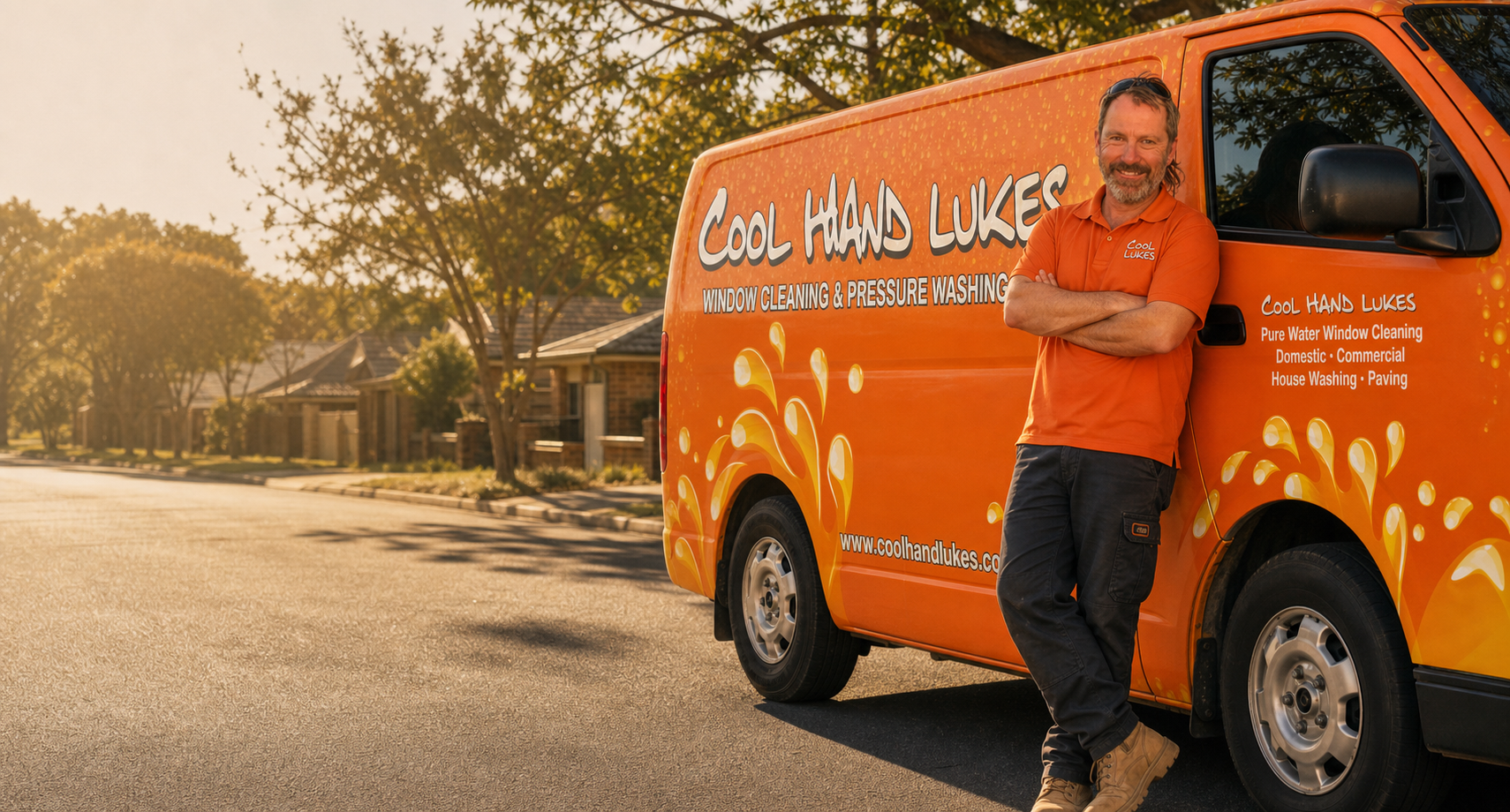
The opportunity
Blackmagic Design. SEW-Eurodrive at six-plus years. A Falls Creek resort. A home that sold two hundred grand over estimate. Most cleaning businesses never get proof this good. Yours sits on a separate page, dated 2014, no photos, nowhere near the homepage. A first-time visitor sees none of it.
Request a Quote is a flat image linking to a generic form. No ballpark, no service-and-suburb estimate, no way to start an enquiry after hours. The customer who is ready to book has to write an email and wait. Most of them just won't.
Cool Hand Luke's ranks across 86 Melbourne suburbs. Every one of those pages drops the visitor into the same 2015 layout: carousel hero, image buttons, no conversion design. The search traffic arrives. The page cannot turn it into a job.
The approach
I started where you would start with an old car worth keeping: under the bonnet, not in the showroom. The audit went through the live site, the stylesheet, the sitemap and every testimonial. It did not find a write-off. It found a business with a real reputation and real search rankings, sitting on a 2015 build that simply stopped getting maintained. The problem was never the brand. It was eleven years of deferred work.
Here is what you already got right, and what this whole project protects: the van. Window cleaners are their vehicle. That orange wrap in someone's street, the hand-brushed name, the splash of water down the side, the crew in matching shirts: that is the most-seen brand surface you own, and it is genuinely good. None of it changes. The restored site is built so that someone who sees the van afterwards recognises it on sight.
So the sequence is a restoration sequence. Anchor the brand to the van first, with the orange as a fixed point matched to the wrap, not a colour picked on a screen. Then rebuild the structure underneath: mobile-first, fast, with a real quote path. Then bring the proof forward and date it to now. The 86 suburb pages get migrated, not binned: same map, new template, rankings intact. Contemporary bones. The character stays.
Brand direction
The orange is not a design decision. It is already on your van and your crew shirts, and those are not getting re-wrapped because the website changed. So it is the fixed point everything else is built around. The 2015 site did not have too much orange; it had orange with no discipline, poured edge to edge behind bubble textures. The restored palette keeps the exact same orange, gives it room to breathe, disciplines the neutrals into one clean warm scale, and adds a deep rust for depth. The website and the van finally read as one brand.
Headings stay condensed. Condensed lettering is the language of trade signage and vehicle livery, so it carries the heritage in the type itself, not in fake-vintage decoration. The hand-brushed wordmark stays exactly as it is. The body text is where the lift happens: the old site leaned on a default Arial stand-in that signalled nothing, served over an insecure connection. The restored body face has warmth and loads clean, so the site reads like a real business wrote it.
The voice gets restored straight from your own testimonials. Your customers already wrote the brand for you: Luke and the boys, Luke even did a few extra things, a facilities manager counting six or seven years. That owner-present, trade-honest register is the real Cool Hand Luke's voice. The new copy is built on it. The leading-provider, look-no-further filler goes.
Luke Orange · #de6c2a
Anchor · the van and the shirts
Burnt Umber · #241a14
Dark sections and headings
Lime Wash · #f7efe3
Background and surface
Rust · #a8431a
Action and depth
Stone · #c9b9a3
Borders and detail
The logo
The mark is the hand-brushed wordmark already painted on your van and printed on your shirts. The restoration is not a redraw. It is a clean, high-resolution file, the warm white set right, and proper transparent versions for both light and dark backgrounds, so the same mark works everywhere instead of only on orange.
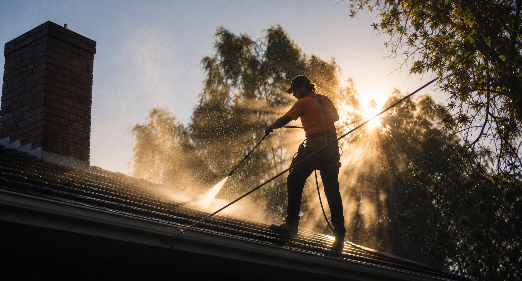
It earns its keep because it is already working. The name does the heavy lifting: a tradesman actually called Luke, running a business named for the 1967 film. That is memorable, it has character, and it is already on the most-seen surface you own. Redrawing it would throw away a decade of recognition. Restoring it compounds that decade instead.
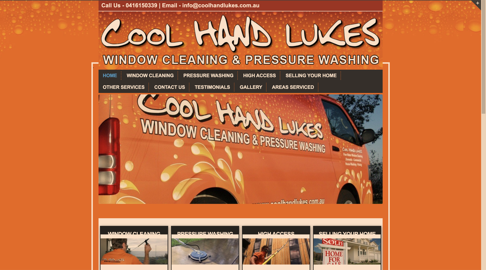
Below is the mark as the world currently finds it: the wordmark doing its job, but trapped inside a website built in 2015. The identity is right. Everything around it is what the restoration fixes.
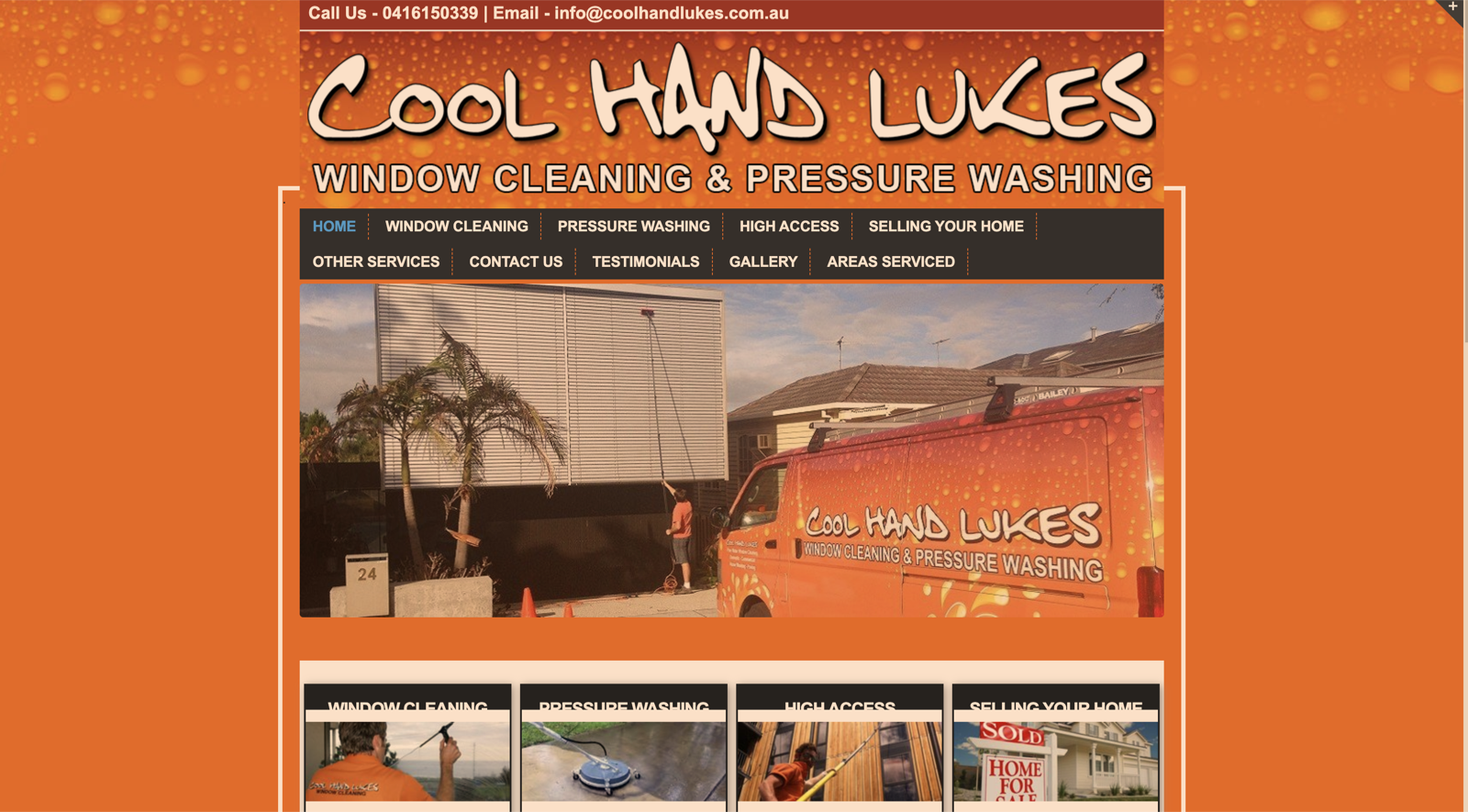
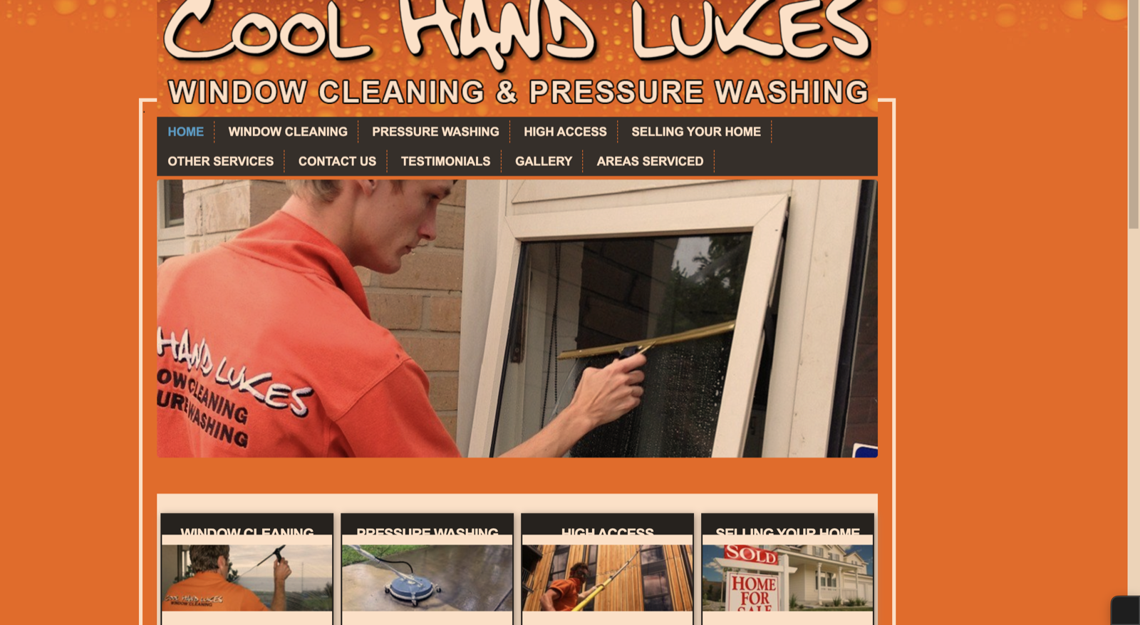
Same wordmark, eleven years on. We're restoring everything around it.
The photography
Two new photographs sit at the heart of the restored brand. Neither is borrowed from the old site.
The 2015 site had real job photos: a worker on a ladder, a clean window, before-and-afters. They were honest, and they were dated. Pulling them forward would have been imitation, keeping the photography just because it was already there. We shot the brand fresh instead, with intent, and only on the surfaces that matter.
The van and Luke shot is the heritage exactly as it stands: the orange wrap, the hand-brushed name, the owner of the business in the street where customers actually meet him. Contemporary photography, unchanged subject. The van doesn't get re-wrapped because the website changed, and the photograph proves how much that's worth.
The rooftop spray, shot into the morning light, treats window cleaning with the seriousness it deserves and the warmth a hand-brushed brand asks for. Most service photography is functional. This one isn't. It's nostalgia carried by craft, not by costume.
That's the whole restoration in two pictures. Honour what's real and lift it. Don't dress it up as something it never was.
The homepage
Your restored site, embedded live below. Not a screenshot: tap through it. The services, the suburbs, the quote flow, on a phone and on a desktop.
Plain HTML + CSS · No framework · No CMS · Full operator control
Built capability
The agent handles the two enquiries that actually drive the business: quote triage and time-sensitive bookings. Two examples below.
Quote enquiry
How much to do the outside windows on a double-storey in Brighton?
Happy to ballpark it. A double-storey exterior in Brighton usually lands between $180 and $260, depending on window count and access. One-off, or would you want it on a regular cycle?
Probably every few months. Can someone come and confirm?
Done. A regular cycle usually brings the per-visit price down too. I'll get Luke to lock in a firm quote: what's the best number, and a day that suits?
Booking enquiry
Need a builders clean in Port Melbourne before a settlement on the 28th. Possible?
That's a builders final clean, windows, frames, the lot, and yes, we do them. The 28th is tight but workable. Is it a house or a commercial fit-out?
Townhouse. Three levels.
Three levels means we bring the high-access gear, no ladders or boom hire needed. I'll flag this as time-critical so Luke prioritises it. What's the site address and your contact?
Live wiring uses Claude (Anthropic AI) with a system prompt tuned to the Cool Hand Luke's services, suburbs and tone. The agent is scoped and the prompt is written. Wiring it is the first retainer task after we close.
Brand rollout
Your van and your crew are already out there doing the work. The restored site is built to match them, so the brand reads as one thing whether someone meets it in their street or on their phone.
The van
Current
Direction
Vehicle livery
The Van
Cool Hand Luke's · Window & Pressure · Melbourne
The crew
Current
Direction
Crew uniform
The Shirt
Cool Hand Luke's · On the tools since 2013
Nothing on the van changes. The site is built to it. If the kit is ever refreshed down the track, new signage, new shirts, a second van, the brand system is already there to grow into, on your timeline, not forced by a website.